


04.03.2026
7 Recruitment Biases Even Seasoned Specialists Still Fall For
A career portal is your company’s elevator pitch to top talent. It should hook candidates, showcase corporate culture, and make them think, “This is the perfect place for me.”
However, many HR and Employer Brand specialists hit roadblocks when building a compelling careers page.
☹️ High traffic, zero traction: candidates browse but bounce without applying.
☹️ Just another job board: a plain list of vacancies with no story to sell the company.
☹️ Lack of differentiation: the page blends into a sea of similar career websites, offering nothing memorable.
How do you turn your career portal into a conversion machine? In this article, we’ll break down what IT specialists actually want to see and how to measure whether your page is doing its job — literally.
Done right, a career website turns passive browsers into engaged applicants. Here is why it’s a must-have:
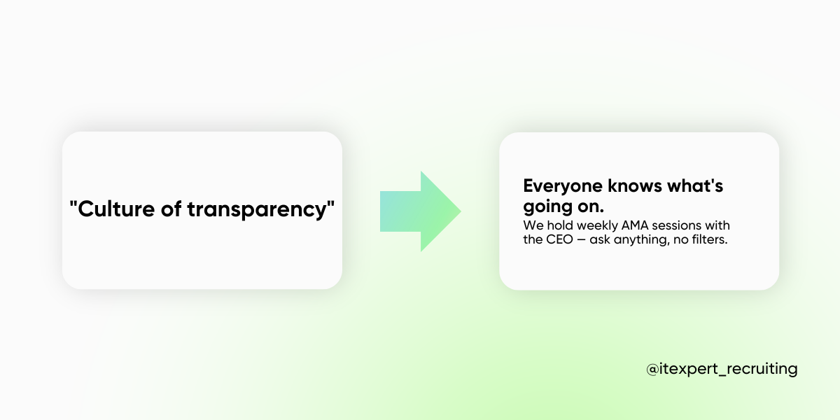
💡 It builds a standout employer brand. Think of your career website as a backstage pass to your company. Candidates get a real feel for the team, culture, and values — helping them decide if they vibe with your mission.
🔎 It answers questions before they’re even asked. According to LinkedIn, 75% of candidates research a company online before applying. A strong career page gives them all the necessary info — no endless Googling is required.
🎯 It attracts the right talent and lowers hiring costs. Instead of aimless job board scrolling, candidates actively choose your company. The result? Higher-quality applicants and lower cost-per-hire.
🚀 Growth mode? A career website scales with you. If you are scaling fast, automation + a well-crafted job portal = a hiring machine. No more recruitment bottlenecks.
🧩 It simplifies hiring for complex roles. Got multiple employment models — full-time, freelance, gig contracts? A career website makes it crystal clear, so candidates know exactly where they fit in.
Pro tip: Combine great design with automation for application processing, and you’ll supercharge hiring speed while keeping the candidate experience seamless.
A high-performing career page isn’t just about listing open roles — it is about answering the right questions before candidates even ask them. Here are five key elements that will hook top talent and boost applications.
What: area, mission, and corporate culture
Before hitting “Apply,” candidates want to know: does this company match my values and career goals? A generic “About Us” won’t cut it — show, don’t just tell what your company stands for.
What to do:
✅ Demonstrate values through tangible actions, not just words.
✅ Write a short, engaging intro about the company — skip the corporate jargon, though.
✅ Use authentic voices. Quotes from founders, employee testimonials, or behind-the-scenes stories make the culture feel real.
What: stack description, challenges, and features
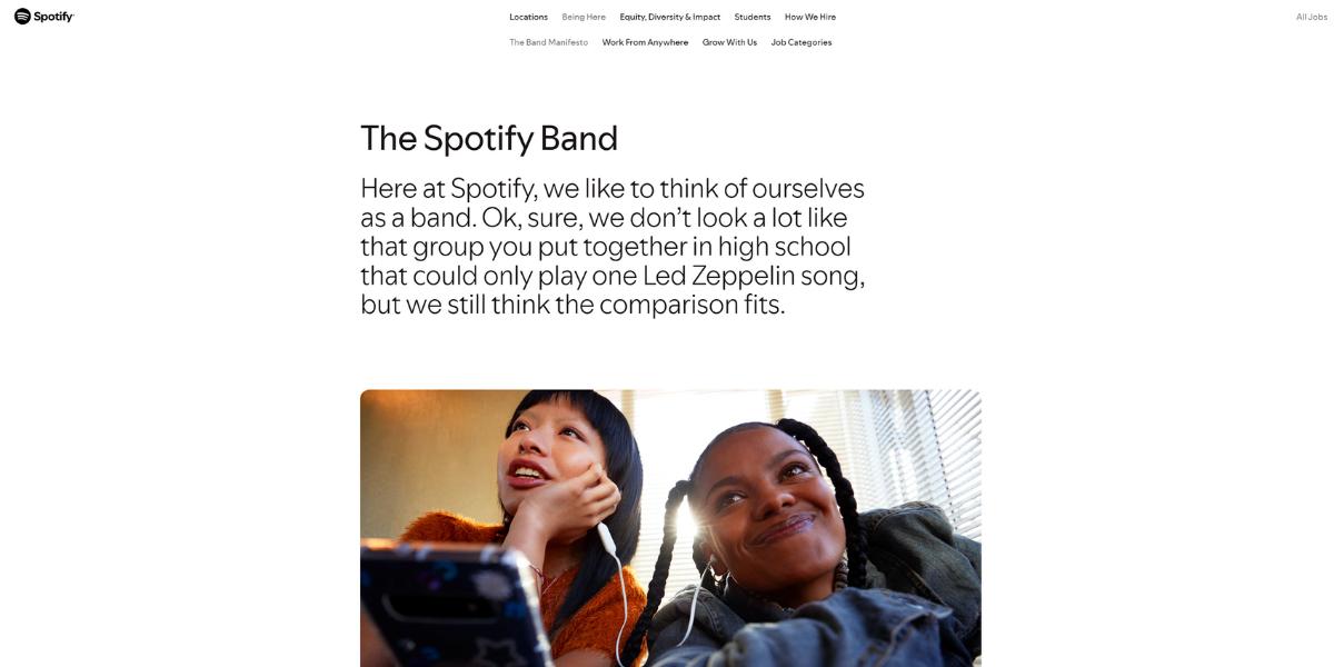
Tech talent doesn’t just want a paycheck — they want exciting challenges and the right stack to grow their skills. The more transparent you are, the easier it is for candidates to see themselves in your team. For example, Spotify goes beyond just listing technologies — they provide a detailed breakdown of their stack, the engineering challenges they tackle, and even the service architecture in their dedicated Engineering section. To engage tech talent even further, they maintain a technical blog where engineers share real-world case studies, problem-solving approaches, and lessons learned from complex projects.
What to do:
✅ Show your tech stack — list the core technologies, frameworks, and tools your teams use. A visual tech map or stack badges (like Spotify does) make it scannable and engaging.
✅ Highlight real challenges — are you scaling to millions of users? Migrating to microservices? Optimizing AI models? Share real technical problems your teams are solving.
✅ Give a sneak peek into architecture — a high-level diagram or case study can help candidates understand how things work under the hood.
✅ Maintain a technical blog — engineers love learning from peers. Sharing case studies, post-mortems, and deep dives into your development process makes your company stand out.
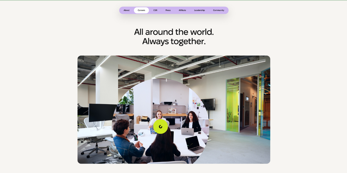
What: employee stories, team photos and videos
Before applying, candidates want to know: who will I be working with? Will I fit in? Seeing real people behind the company makes it easier for them to picture themselves as part of the team.
What to do:
✅ Add a “Meet the Team” section — include photos, roles, and short quotes from employees. Take inspiration from Wix, which showcases personal insights from team members, making the company feel more relatable.
✅ Record a video interview — let employees share what it’s really like to work there. Keep it authentic and unscripted — real voices are more convincing than polished corporate messaging.
✅ Feature people across all roles — don’t just highlight C-level employees. Show engineers, designers, analysts, and other specialists to give a well-rounded view of your team.
👉 No one has time for a 10-minute corporate documentary. Stick to 60-second videos with quick insights, team moments, and real talk about work life. Think snappy, engaging, and to the point.
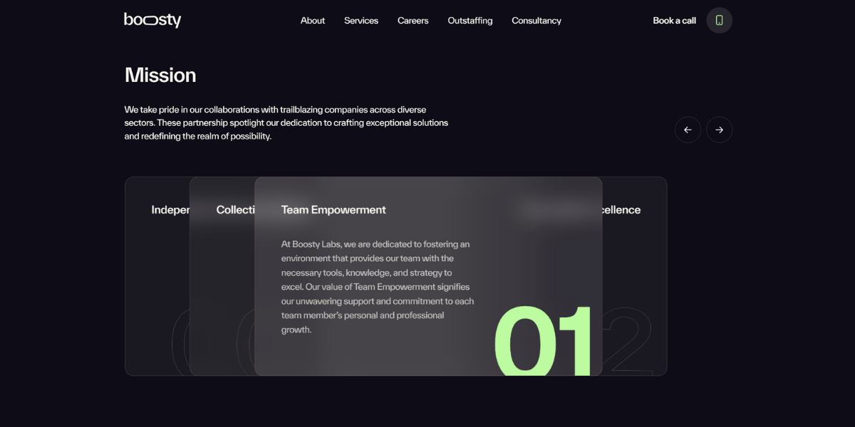
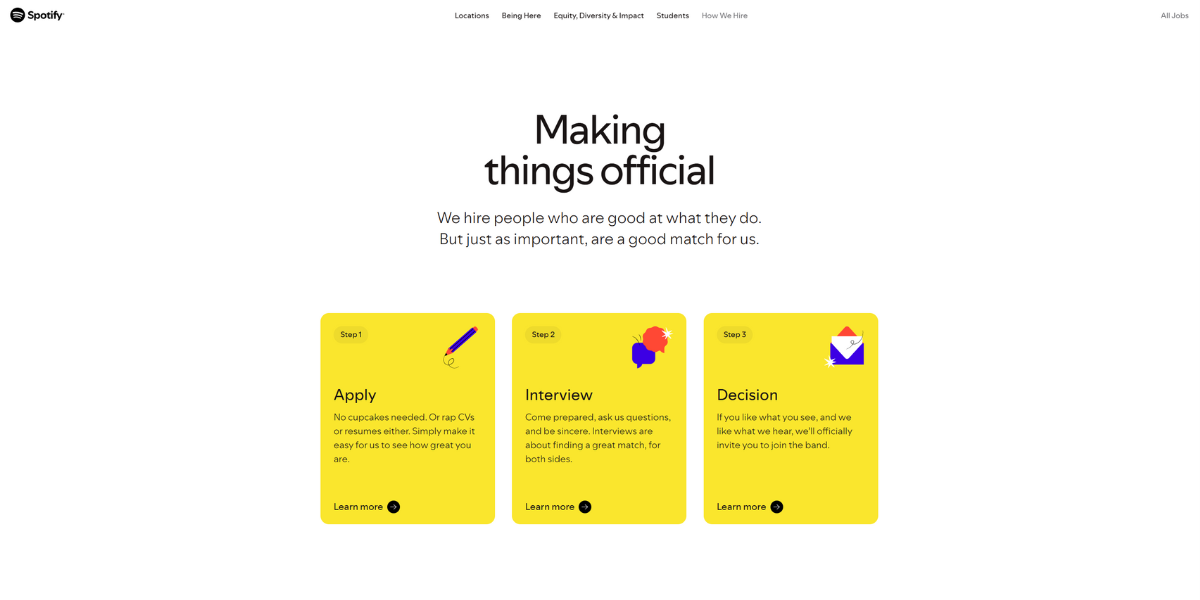
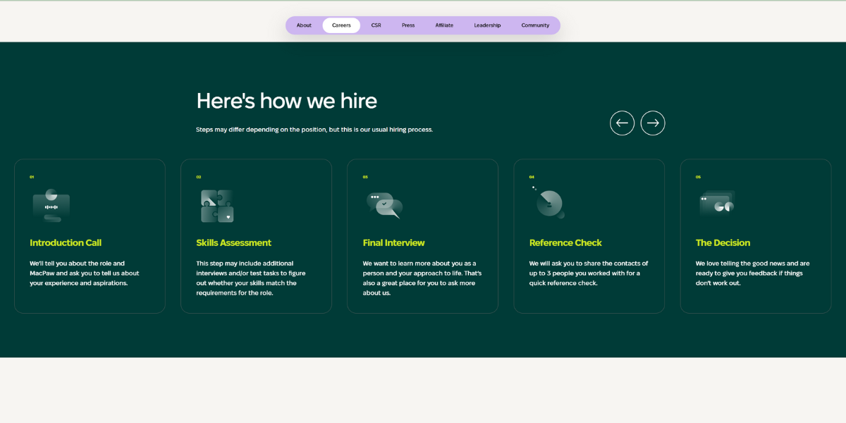
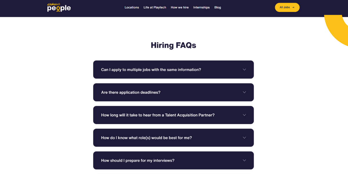
What: details on the hiring process
No one likes mystery recruitment. Candidates appreciate knowing what to expect — how many stages, how long it takes, and what’s required. A clear roadmap makes the process feel fair and transparent.
What to do:
✅ Add a “How We Hire” section — outline the steps of the selection process (e.g., application, tech interview, final round) with estimated timelines.
✅ Post FAQs & preparation tips — address common concerns like “What’s the interview format?” or “What skills should I focus on?” Bonus points for including insights from recruiters or hiring managers.
✅ Be upfront about test tasks — if coding challenges, case studies, or take-home assignments are part of the process, let candidates know upfront so they can prepare.
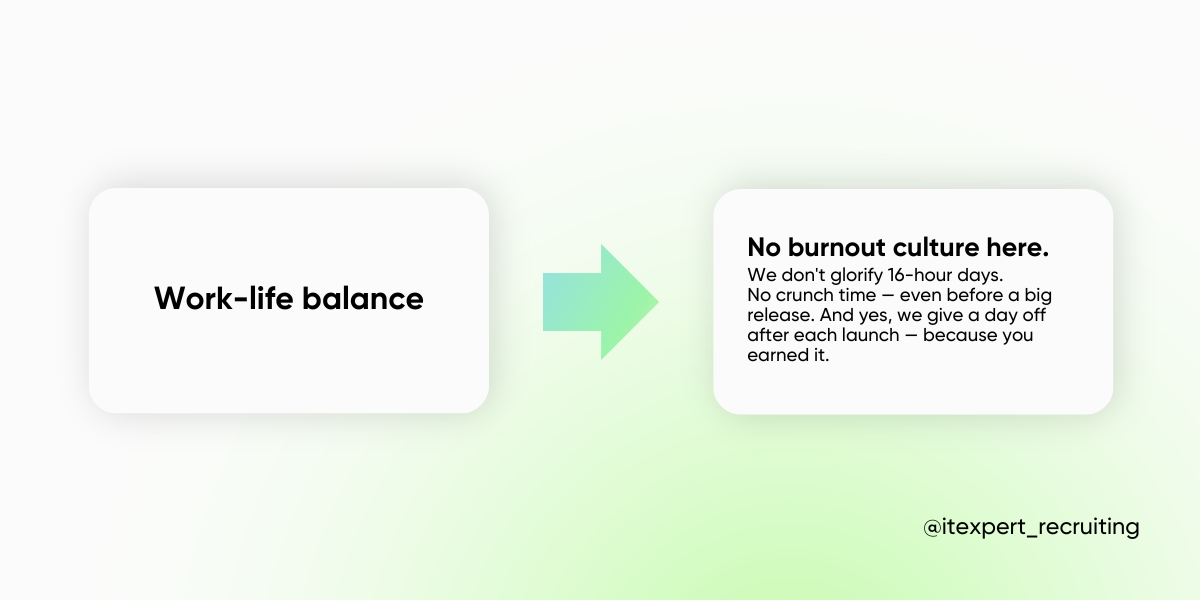
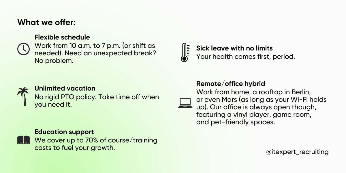
What: details about training, career development, work-life balance
Let’s be real — salary alone isn’t enough to hook top talent. Candidates want to know: will I grow here? What’s the work-life balance like? A substantial benefits and career growth section helps seal the deal.
What to do:
✅ Create a “What You Get” block — list perks, training programs, and compensation highlights.
✅ Show career growth paths — outline promotion tracks, mentorship programs, and learning opportunities within the company.
✅ Add employee testimonials — real stories on how team members have grown their careers make your promises tangible.
Make it easy to “Refer a Friend.” Since 30–50% of hires come from recommendations, streamline the process:
Candidate finds a job → clicks “Share” → Sends it to a friend → this friend gets a preview + “Apply” button. HR gets a note that the candidate came from a referral
💡 Pro tip: optimize the career page UI. Add advanced job search filters (industry, experience level, location, remote/hybrid). And don’t forget mobile optimization — 89% of candidates job hunt on smartphones, with 45% checking vacancies daily.
Hooking top talent and nudging them to hit “Apply” is more challenging than it looks. In fact, 90% of career site visitors bounce without even checking vacancies. So, what’s going wrong?
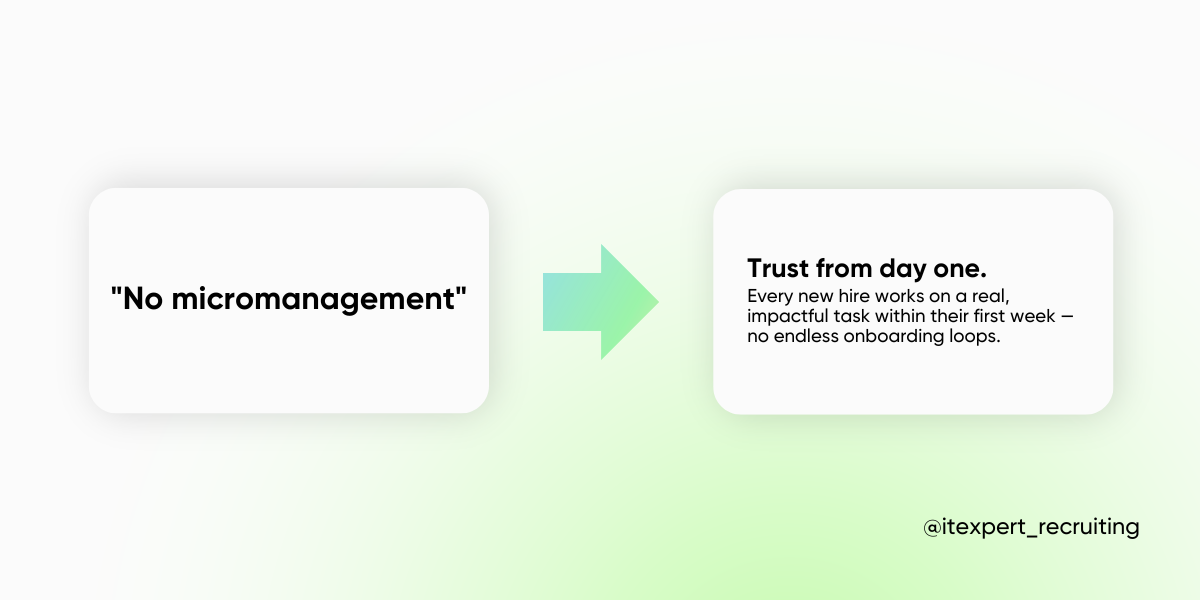
Fix it! Ditch the corporate fluff and get specific. Instead of: “You’ll work on innovative projects” choose more engaging and clear “You’ll develop a platform used by 5M people daily.” Instead of: “We have a great team atmosphere.” use “Every Friday, we host Dev Club meetups to discuss tech trends and brainstorm solutions.”
Highlight career development paths with actual examples: “Andrey joined as a junior, completed our internal training, became an architect, and now leads complex technical solutions.”
Make it simple. Some good CTAs:
✅ “Send your CV and a quick intro about yourself.”
✅ “Fill out the form and get a test task.”
✅ “DM our recruiter on ___ for a quick response.”
The best companies turn job seekers into engaged candidates by making their career websites immersive, interactive, and downright fun. Let’s check out some top-tier strategies and how you can steal (ahem, adapt) them for your own hiring game.
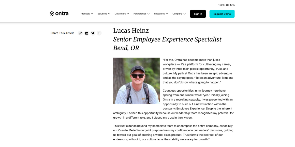
Employee growth in action — real stories, real progress, real impact. Instead of dry corporate updates, legal-tech company Ontra launched a quarterly series where employees share their career milestones, from promotions to internal transitions and game-changing contributions.
Why it works: Career growth isn’t just a bullet point on a job description. By showcasing real journeys, Ontra makes career mobility within the company visible and inspiring.
✅ Pro move: Create a “Career Journeys” section or blog where employees highlight their growth stories, making internal opportunities more transparent.
Insurance companies have long been associated with certain clichés, such as “suits, ties, and dull office cubicles,” “still using fax machines in 2025,” and so on. People assume insurance companies are strictly traditional, lacking creativity and innovation.
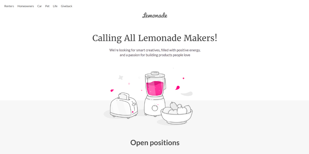
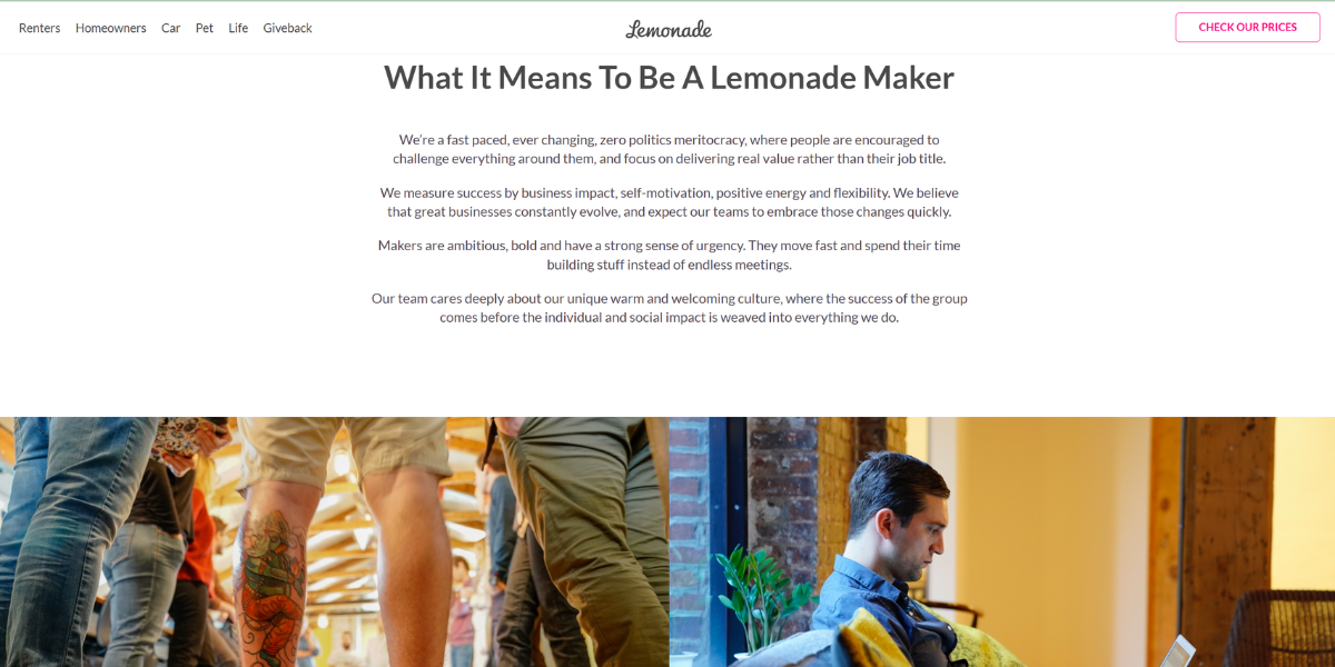
Modern insurtech companies like Lemonade are actively working to break these clichés by emphasizing speed, transparency, customer-centricity, and a tech-driven approach. It presents a career page that feels more akin to a tech startup than a traditional insurer. They emphasize a flat organizational structure, transparency, and a playful brand identity.
Why it works: This presentation disrupts the conventional image of the insurance industry as dull and hierarchical, appealing to creative and tech-savvy professionals.
✅ Pro move: Incorporate interactive storytelling, employee spotlights, behind-the-scenes content, and playful ToV to showcase a vibrant, innovative workplace that challenges outdated industry norms.
Forget static office photos — MacPaw created a virtual experience where you can hover over an image, and suddenly, the office comes to life — employees deep in discussion, code flowing, and coffee brewing.
Why it works: It’s interactive. Candidates can imagine themselves in the workspace before ever stepping inside.
✅ Pro move: Invest in a 3D virtual tour or add animated office photos that move when hovered over. And throw in some fun (and/or serious) facts: “If you lined up all the code we’ve written this year, it would wrap around the Earth!”
The BBC crafted an interactive career path journey where candidates “live” a day in the life of an employee, following them through meetings, challenges, and coffee breaks. It is first-person storytelling at its best.
Why it works: People love imagining themselves in a role. This makes it easy.
✅ Pro move: Instead of dry job descriptions, create an interactive “Day in the Life” where candidates experience the job before applying.
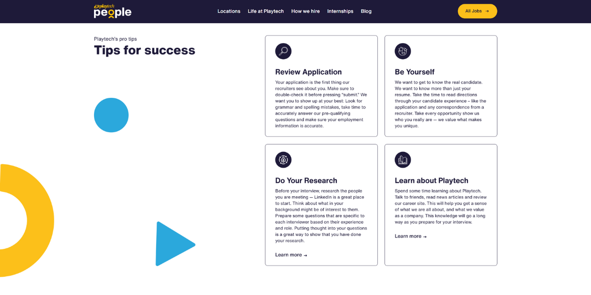
No one enjoys getting ghosted or refused after an interview — Playtech boosts applicant’s chances by offering insider tips on CVs, test tasks, and interviews.
Why it works: A little guidance can mean the difference between a great candidate applying — or bouncing.
✅ Pro move: Share checklists, interview prep guides, and recruiter insights so candidates feel prepared, not blindsided.
A well-optimized career website does more than attract traffic — it converts visitors into applicants. But how do you measure if your career page is actually working? Here are the key metrics to track.
Formula:
What it tells you:
🔴 Low conversion (<5%) → Something is off. The job post might be unclear, the application process too complex, or the CTA is weak.
🟡 Good conversion (5–15%) → Your job descriptions are engaging, and the UX is working well.
🟢 High conversion (15–30%) → Your job posts are on point, and the application process is frictionless.
Formula:
What it tells you:
🔴 <10% → Low return rate. Not necessarily bad if your conversion rate is high.
🟡 10–25% → Balanced. Indicates candidates are considering applying.
🟢 25%+ → High interest, but if conversion is low, check if the application process is too complicated.
*If your website has blogs, videos, and employee stories, a high return rate could mean strong employer branding. If it only has job postings, a high return rate could mean hesitation or application barriers.
Formula:
What it tells you:
🔴 If only 1 out of 10+ applications is relevant → Improve job description clarity and add screening questions.
🟡 If too few applications are coming in → Your job post might be invisible or not compelling enough.
🟢 If most applications are relevant → Your job postings are clear, well-targeted, and reaching the right audience.
If your career website is just spinning its wheels and not reeling in top-tier talent, it is time to debug the system. Amp up engagement with interactive elements, fine-tune your SEO to climb the search rankings, and supercharge your reach through social media. Do it right, and you won’t just be racking up page views — you’ll be onboarding rockstar candidates who can’t wait to hit “Apply.”


